deviant art

Deviant Login Shop  Join deviantART for FREE Take the Tour
[x]
Shop Similar Prints
This Print Not Available
more ▶

More from =FooRay

Featured in Groups:

Details

May 17, 2012
1.6 MB
1800×1413
Sta.sh
Link
Thumb

Statistics

Comments: 30
Favourites: 84 [who?]

Views: 3,403 (0 today)
[x]
Mature Content Filter is On
(Contains: strong language)
:iconfooray:
*edits* ( unfortunately if you had any critiques for the Art itself I cant make those changes quite yet, BUT I will be using all of your helpful notes you gave when re drawing the final pages. The changes made here are based on the notes you gave about the caption boxes and grammer issues. Even though this wont be the final look it gives me a better idea of where to go with it when i get back to this point. I DO hope that this version is more pleasing to the eye.. and if you have anymore suggestions of even have questions, PLEASE let me know. to everyone that commented i will try and respond to you directly but for now. THANK YOU ALL!.. really! youve all been very helpful and its great to see all the feed back. Look forward to a brand new bit of teaser art for FoA in the coming week. )

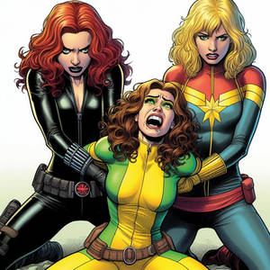
This was a Test Page for "FoA: Fangs of Angels" featuring "Lani" that I had done in 2008 with :icononefreeinternet: doing the color work.

I wanted to have a painty feel to the pages so they could feel sort of... cinematic.

Currently trying to teach myself to color in a softer shading style so that eventually I can capture the look I was going for myself.

If you take the time to read it all ( I know its kinda wordy ) please feel free to give me feed back. I'm sure theres probably atleast one typo in there and the page is old so style wise it might look kinda different, but tonally it's pretty much what I was going for.

hope ya dig it.

-FoO
Add a Comment:
 
:iconhawkmacnaughton:
I think wordy might not be the... word for it. I think the number of words is good. I just think it needs to be spread out. If it were a novel or a short story, I would say that you've got a nice quick bit of exposition and you want to get on to showing instead of telling. In comic form, though, I'd think perhaps pacing would be the issue. Show her doing something as she comes to the part about leaving and "if this is my life now," for instance. Voice-overs in movies, for example, are usually carried out during scene transitions and to either shed light on something that's just happened or set a tone (or contrast) to something that's about to happen.

If it were me, in my never-humble opinion, I'd take the last four boxes and move them to the next page, whatever that happens to be. I'd take the bottom box in the second panel, move it to the third and split it in half, with "I know some people need to make their own mistakes. My real dad taught me that much. But this wasn't my mistake." up in the upper left there, and "I'm running out of reasons to stay here." down where you've currently got that last one. Which works with that panel because she's laying there staring out at the rain. Sorta braids the visual of her lying there with the idea that she's still dressed and thus not necessarily committed to the pillow for the night yet.

That's just my nickel's worth, based on what you identified as something you're not satisfied with. The art is beautiful - I love all your stuff, honestly - and I'd like to see where this goes. If I were standing in a comic shop reading this I'd definitely be flipping pages and probably laying down some cash.
What do you think?
The Artist thought this was FAIR
3 out of 3 deviants thought this was fair.

:iconomnijerbear:
Though it might be considered wordy, it conveyed she's an emotionally torn and broken teenager that had a major decision to make, one that will affect her whole life. It's also one no child should make; leave a hostile environment behind in hopes it will be better, or stay to support her emotionally blind mother?

She had the intellect to know what's logical; but she doesn't know if she has the heart to make the right decision.

I also appreciated the placement of the text boxes as it provided a surreal observers view when coupled with the painted backgrounds. As if we sympathize with her, yet at the same time question why she hadn't left yet.

I did have an issue with the text box used for the opening location. Mainly set the tone a there would be some intense moment amongst physical actions. Also, it seemed out of place after reading through the entirety of the page, especially since it was stylized so differently.

Then again, this was done four years ago, so there is a lot of room for polish
What do you think?
The Artist thought this was FAIR
6 out of 6 deviants thought this was fair.

The Artist has requested Critique on this Artwork

Please sign up or login to post a critique.

love 2 2 joy 0 0 wow 0 0 mad 0 0 sad 0 0 fear 0 0 neutral 0 0
:iconsynscythe:
First off great work

"She's gotta know that's B.S. no one abuses people out of caring."

Suggestion:

"She's gotta know that's B.S. no one abuses people out of affection."

Reason: For some reason using the word caring here just doesn't sound right to me. (but I may be the only one with this problem so I really wouldn't take this seriously)
Reply
:iconomnijerbear:
~OmniJerBear May 19, 2012  Hobbyist Writer
I know there wasn't anything drastically different, apart from the beginning text box and the text box format overall, but I think it allows a level of immersion that the previous sharper text boxes couldn't produce.

The only additional critique I have possibly, and this is purely based on my opinion and what I think might add some added weight to the entire situation, is dialogue in the opening panel of Lani's mother and stepfather arguing, nothing of importance or relevance to be honest, just something that I think that would immediately pull a reader into this scene of abuse, heartache, and hardship giving the reader all the more reason to relate and connect with Lani, almost as if they were there to comfort her and help her make the decision. Additionally, it would emphasize that line about the walls being paper thin and trying to hide the ugliness of the situation when it's just something at the moment she can't run away from
Reply
:iconfooray:
=FooRay May 19, 2012  Professional Artist
in the original draft there was the parents arguing throughout the whole page. ill show you on skype.it was messier for sure. and lani talked less but visually it left something to be desired. but good notes, thanks again.
Reply
:icontiomara:
~Tiomara May 19, 2012  Hobbyist General Artist
Definitely digging the style on the right more
Reply
:iconreirei:
*reirei May 19, 2012  Professional General Artist
I agree with most of what people have already said. :> Make the text boxes a solid color, maybe change the font and other than that it looks beautiful and i want MOOOOAAAAARRRRR. :heart:
Reply
:icondgriffinxl:
It seems to me that one full page of intro is just enough, so I think this is the perfect amount of text/exposition/inner monologue to establish the character, situation, and emotional tone, while the visuals very clearly establish the location, scene, and overall feel. I instantly feel like I understand what's going on visually and emotionally, and I already empathize with the character, so now all I want to know is what happens next! Any more text and I'd start to lose interest, so I'd expect the next page to vault into things happening by "showing" rather than "telling" some dramatic event to really kick off the narrative and compel our hero into action: Does the stepdad burst into the room yelling? Is there a crash or noise of violence that our hero has to investigate? Whatever it is, I'm eager to find out, and if after establishing the context with this text and these visuals you then launch into compelling dramatic events and actions, I'm hooked. Can't wait to see more!
Reply
:iconedtadeo:
Hi there. Been watching your artworks and I'm very impressed with your designs, though I've been wanting to see you do some backgrounds, including sequential like this. ;)

Not gonna critic on the writing coz I'm not a good writer myself, but I'll say something about your paneling and layout. Since your page is very limited on panels, I guess I'll exclude the sequence of your panel. First box, you did great on showing the establishing shot of the house. Looking down or up is a good way to show depth. But it would also be great to show the sky and storm clouds, including little lightning from afar. Also just to show the rain drops are coming from the sky, coz I may expect someone is using a sprinkler. :D Also, you should have used a vanishing point (or two) to give more dimension to your perspective. And, what was that little water ripple on the far right corner? There should be more of that in random sizes.

Your second panel has good framing. We can see the main focus of the shot. We can see clearly who's in the panel. But is this the same house? The wall outside doesn't seem like same wall as the first panel. ;)

Good expression on the face. I like it! The interaction of the figure to the pillow is great. The shadow is well distributed. Though the angle is like a zoom-in of the 2nd panel, which is OK unless 2nd panel is not showing her facial expression. If the 2nd panel is just her back facing the audience I guess it's okay to show her face on the 3rd.

Over all it is one good page. Today, we can't make everybody happy by looking a basic page. Each page should give one big impact even on captioned or narrated sequence like this. A scene of sequence will work if there's a one BIG panel on a page that will blow the audience away. It can be your 1st, 2nd or 3rd panel. You decide or which ever has the most expressed emotion you have in a scene.

So far so good. Keep those awesome artworks coming. ;) :thumbsup:
Reply
:iconfooray:
=FooRay May 18, 2012  Professional Artist
thanks for taking the time. very helpful somethings you pointed out i wouldn't have noticed. like the wall paneling.. i thought i remembered drawing it but i do think they were over emphasized in the second frame. i did a very basic perspective on the house, I was and am still learning more on perspective all the time. though when i re-draw this page that is one mistake ill definitely be tackling. i always imagined that the page was kind of a crane shot slowly zooming into her complete stillness... kind of her borderline numbness to her home life. ill try and figure out a way to make that more impactful on the re draw. thanks again for taking the time to read and write back.

-FoO
Reply
:icono0plur0o:
Ok honestly.. I cant move past the obnoxious purple letter boxes...
Reply
:iconfooray:
=FooRay May 17, 2012  Professional Artist
if that was enough to stop you all together you 1, dont read comics and 2 wouldnt have really cared either way. but thanks for the........constructive? criticism...
Reply
Add a Comment: